
Read
20 min
Date
Jan 15, 2026
Category
Photography
COLOR THEORY IN EDITORIAL PHOTOGRAPHY
How deliberate color choices shape mood, guide the eye, and give a series of images a unified visual language

Color is rarely neutral. Before a viewer processes what's in a frame, they respond to its color temperature and palette — warm, cool, muted, saturated. That response happens before conscious thought, which is why color is one of the first decisions we make, not the last.
At the studio, color isn't corrected into an image during editing. It's planned for during the shoot, then preserved and refined afterward.
Starting With a Palette, Not a Filter
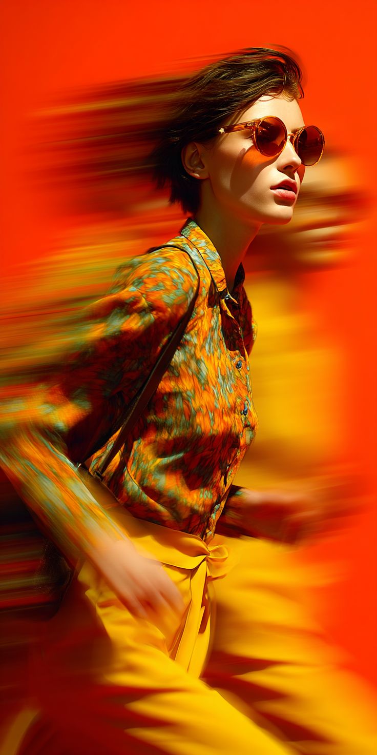
Rather than applying a preset look across every project, we build a palette specific to the story being told — informed by location, wardrobe, and the mood the client wants to communicate. A brand campaign about heritage and craftsmanship calls for a different palette than one about speed and modern minimalism.
This means color decisions start with location scouting and wardrobe conversations, long before a single frame is shot.
Complementary Versus Analogous
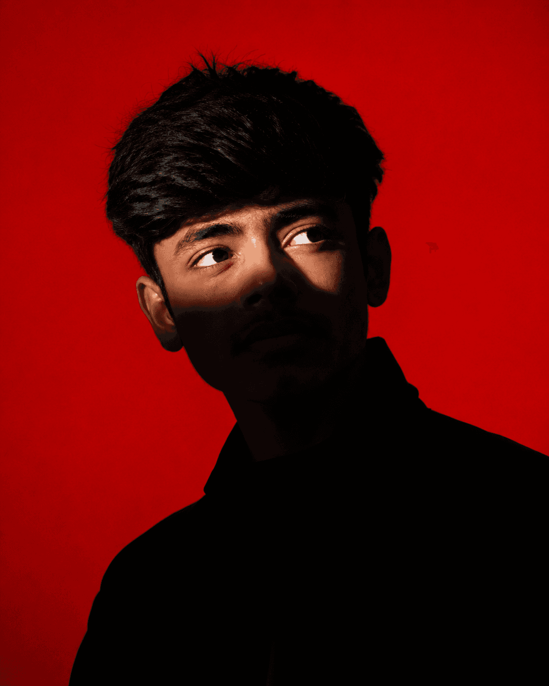
Two approaches show up most often in our work. Complementary palettes — colors from opposite sides of the color wheel — create contrast and energy, useful when a subject needs to pop against its environment. Analogous palettes — colors sitting close together — create harmony and calm, useful for quieter, more editorial work.
Choosing between them isn't a technical decision. It's a narrative one, made based on what the image is meant to feel like.
Consistency Across a Series
A single strong image is one thing. A series that feels cohesive — where every frame belongs to the same visual world — is harder, and it comes down to consistent color response across every shot. We calibrate for this during editing, aligning white balance, tonal range, and saturation across the full set rather than treating each image in isolation.
Editing as Refinement, Not Reinvention
Because color is planned during the shoot, editing rarely means correcting mistakes — it means refining what's already there. Subtle grading, controlled contrast, and careful attention to skin tones round out a palette that was already intentional from the first frame.
A Considered Approach
Color theory isn't a filter applied after the fact. It's a language decided on before the shoot begins, carried consistently through every stage of the process, so the final images feel like they were always meant to look this way.


" height="25.00139023844741px" id="jBymG44fK" transform="translate(7.499 7.499)" width="25.001390238447406px"/></svg>)
